
Video of the new doc in the upcoming MacOS Leopard. I’ve never really liked the dock in OSX. It’s too smug. And I’ve always felt it offers crappy visual feedback on what applications and files are currently open. Expose is excellent way to do exactly this with a single click. BUT I’d like to point out that that the much-maligned Windows taskbar provides highly efficient visual feedback – with zero clicks.
So a redesigned dock, maybe enough to finally get me off my butt and switch? maybe. But if “enhanced 3d reflections!” is the best productivity enhancement they can offer I’d be worried. Aren’t you getting tired of reflections?.
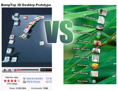
Reflections aren’t the only things that’s new however. Do the new stackable and fanabale “collections” remind you of anything? Poor Anand, some of Leopard is straight out the BumpTop’s demo sensation of 2006. This is the trouble of trying to build a company out of a set of cool features. Especially cool features that are also self-revealing to your would-be customers or competitors*.
*I’m going to assume royalties aren’t being involved here. Then again, has anyone seen this before BumpTop?